Stage design · sightlines · branding
How to Design a Conference Stage That Photographs Well
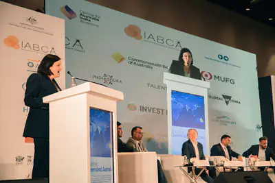
Stage design is also camera design. Logo position, furniture height, lecterns, florals, LED brightness and panel spacing decide whether important moments can be photographed cleanly.
A practical planning page built around how the final photographs or films will actually be used.
What strong briefs get right
Four decisions that improve the final visual library.
These are the recurring signals we found across specialist pages, official guidance where relevant, and TAT’s own corporate production experience.
Faces before spectacle
A dramatic room can still photograph badly if speakers have uneven or coloured face light.
Screens are part of exposure
LED walls, projection and confidence monitors affect camera exposure and colour.
Camera sightlines need space
Lecterns, florals, furniture and moving operators can block the useful angle.
Rehearsal prevents repair work
A five-minute camera-and-AV check can prevent hours of compromised editing later.
Planning sequence
A useful production process is simple enough to follow under pressure.
The workflow changes by assignment, but the order matters: define the use first, then engineer capture and delivery around it.
Design
Share the stage, room and run-of-show before final production.
Test
Check face light, screens, audio feeds and camera sightlines.
Rehearse
Walk speaker movement, award handovers and panel changes.
Capture
Keep exposure, colour and sound stable through programme changes.
Review
Use the finished content to improve the next event setup.
Add first-party proof
Use images that explain something, not placeholders that merely look good.
Both slots stay hidden until Codex or WordPress replaces the comment with a real image, video or iframe.
Suggested media 2: An annotated stage-layout diagram showing good and bad camera sightlines.
TAT field note
High-stakes conference coverage exposes stage-design problems quickly.
Once the programme starts, there is rarely time to move a lectern or shift an oversized floral arrangement.
At events such as JP Morgan, Legal 500 and People Matters, the camera team has to move between speaker, panel, audience and stakeholder moments while respecting the room.
A good stage leaves more than one clean angle and creates predictable zones for handshakes, award handovers and panel interaction.
When every usable frame requires standing in the centre aisle or cropping around furniture, the stage has quietly made the media workflow harder.
Decision table
Translate the brief into production decisions.
Use this as a conversation starter with communications, HR, PR, event, AV or brand teams.
| Decision | What good planning looks like | Common failure | TAT recommendation |
|---|---|---|---|
| Speaker faces | Even, neutral face light | Hard shadows or saturated colour on skin | Ask the AV team to prioritise a clean front-light layer. |
| LED / projection | Readable without dominating exposure | Screens clipping to white or banding | Test brightness and camera shutter before doors open. |
| Panel layout | Clear faces and sightlines | Furniture or lectern blocking speakers | Walk camera angles from audience and side positions. |
| Room ambience | Enough depth to show audience context | Audience disappearing into black | Keep a small amount of controllable ambient level where possible. |
How we think about the work
Useful beats decorative.
The photograph is not finished when the shutter closes. It is finished when another team can actually use it: in a press release, annual report, website, LinkedIn post, investor deck or internal story without having to decode what happened.
Agree the real business use and priority people.
Watch what happens between the scheduled moments.
Deliver an organised set another team can immediately understand.
Build a useful first brief.
No visible line-item pricing. This tool simply packages the decisions that most affect scope and sends them to TAT.
Continue planning
Related Tell-a-Tale Studios pages.
These links move from the planning question into the most relevant service or portfolio context.
Research-informed page: the source map supplied with this pack lists the live specialist/official pages reviewed for this topic. Competitor claims are not copied into this page.
People Also Ask
Direct answers before you request a quote.
The questions are written conversationally so they work for human buyers and answer engines without hiding the practical caveats.
01Where should sponsor logos sit on a conference stage?
Place key marks where they remain visible behind or beside speakers without forcing every photograph into the same rigid composition.
02How much space should panelists have?
Enough for clear sightlines between people, comfortable microphones and clean camera angles from audience positions.
03Are large LED backdrops good for photos?
They can be excellent when brightness and content are controlled. Very bright white slides can overpower faces.
04Should an award handover have a marked position?
Yes. A predictable, well-lit handover zone improves photographs and reduces awkward pauses on stage.
05Can the photographer review stage design before the event?
For important productions, sharing renders or a floor plan can flag obvious sightline, logo or lighting issues early.
06What is the biggest stage-design mistake for cameras?
Treating the audience viewpoint as the only viewpoint. Cameras need lateral sightlines and clean backgrounds too.
Share the brief. We will recommend the smallest team that can do it properly.
Send the date, location, timings, audience, priority stakeholders, intended use and delivery deadline.